Monday 21 March 2011

Feedback

Positive:
  • Voice over is engaging
  • Props make clip interesting
  • Sound track was good
To Improve:
  • Camera shots could have had more variety
  • Credits could be more visually attractive
  • Logo/titles could be more animated

Thursday 17 March 2011

Art of the Title Task


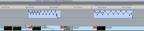
Panel 1) - Shows the title of the sequence This shows use of a conventional thriller, as it uses a dark background to convey the idea of a conventional thriller.  
Panel 2)-shows a type of camera shot, being a close up, this helps the audience feel unaware of what is about to happen to the chicken. The use of saturated lighting also helps it to give a dark feel to the film.  
Panel 3)-shows the antagonist in the sequence, showing the costume which makes them look dark and intense as she is dressed in all black. It also helps introduce the character 
Panel 4)-a chicken being mysterious and creating a sense of unease (thriller convention), however it could be seen as an unconventional symbolic metaphor. 
Panel 5)-shows the prop of the antagonist (pendulum), this is a conventional thriller prop as it is used to hypnotise the protagonist's, and make them unaware of what is about to take place, the chicken is also symbolic to the protagonist. 
Panel 6)-shows the location of the antagonist, scary looking location, isolated area. 
Panel 7)-shows the high angle showing the chicken as weak, symbolic to how the protagonist will be  
Panel 8)-shows a bright background contrasting to the antagonist black clothes dark, which represents the characters personality 
panel 9)-the protagonist looking weak (thriller convention), as it is sown in a high angle also repeated, camera angle used to show the weak chicken. 

Age restrictions

What certification we thought would suit our opening sequence best 

After looking at the BBfC's enquiries and after looking at our film i think the best certification for our film is a 15. This is because our film if it were to be a real one would obtain all of the things below for a 15 film. Meaning no-on under the age of 15 would be able to see the film.   

’15′

Suitable only for 15 years and over

No one younger than 15 may see a ‘15’ film in a cinema. No one younger than 15 may rent or buy a ‘15’ rated video work.

Discrimination

The work as a whole must not endorse discriminatory language or behaviour.

Drugs

Drug taking may be shown but the film as a whole must not promote or encourage drug misuse. The misuse of easily accessible and highly dangerous substances (for example, aerosols or solvents) is unlikely to be acceptable.

Horror

Strong threat and menace are permitted unless sadistic or sexualised.

Imitable behaviour

Dangerous behaviour (for example, hanging, suicide and self-harming) should not dwell on detail which could be copied. Easily accessible weapons should not be glamorised.

Language

There may be frequent use of strong language (for example, ‘fuck’). The strongest  terms (for example, ‘cunt’) may be acceptable if justified by the context. Aggressive or repeated use of the strongest language is unlikely to be acceptable.

Nudity

Nudity may be allowed in a sexual context but without strong detail. There are no constraints on nudity in a non-sexual or educational context.

Sex

Sexual activity may be portrayed without strong detail. There may be strong verbal references to sexual behaviour, but the strongest references are unlikely  to be acceptable unless justified by context. Works whose primary purpose is sexual arousal or stimulation are unlikely to be acceptable.

Theme

No theme is prohibited, provided the treatment is appropriate for 15 year olds.

Violence

Violence may be strong but should not dwell on the infliction of pain or injury. The strongest gory images are unlikely to be acceptable. Strong sadistic or sexualised violence is also unlikely to be acceptable. There may be detailed verbal references to sexual violence but any portrayal of sexual violence must be discreet and have a strong contextual justification.

Wednesday 16 March 2011

Final Cut


We found that our final cut was a success as we had enough time to correct it and when we had uploaded it, we liked the thriller conventions. One of the conventions was the sound track as it was a slow piano meaning it created a sense of mystery. The titles flickered like a candle adding to the suspense and moving the narrative along. The editing was smooth, including fades which made the storyline worryingly structured.  


Thursday 10 March 2011

Editing blog post

On the first day of editing, the group put the film sequence into final cut and took time in placing the shots in the correct place and made sure the cuts were concise. Once this was accomplished the sound track was placed into final cut and put in the right place on the film sequence. Feedback from the teacher meant that the soundtrack was changed to fit with the sequence and the improved sound track was widely acknowledged in the class feedback. We changed the saturation in the sequence as some of the clips were too dark and we tinted them grey to create an eery affect. 


On the second day of editing, we then added titles to the opening and started to add motion to them to make them more advanced. Fades in and out as well as a flicker affect were some of the editing transitions which we used in our sequence, on the titles to create a mysterious affect. Once the titles had motion, we then went through the sequence and tweaked the sequence, using the feedback, to make sure the film was as precise as possible. We experimented with the motion and instead of having conventional titles in the middle of the footage, we placed them in the corners so that the titles did not divert the viewers attention but still showing the titles and credits. We made the sound quieter after more feedback from the teacher so that the voice over dominated the narrative. 


Feedback from Roughcut

Editing:

Really nice cuts but maybe use more varied transitions like fades. The pace of the cuts is very nice and the best transition is at 1:56 as it is really smooth. 

Sound/music: 

Good use of background music, it was constant and reflected the theme of hypnosis and it was kept constant. The heart beat like sounds almost increase or create a sense of tension or unease and their was an effective voice over. The diegetic shuffling sounds of leaves and people talking were ambient. 

Camera work: 

There was an un-rendered transition but there were different zooms and distances. The camera was a little shaky at times and there was no variety between shot types. It was too close up so vary it and add some with more distance. There were no establishing shots and when being shown the clock it could be zoomed in better and more central.

Mise en scene: 

Use of props were good, the chicken and the clock helped the audience relate to the thriller. After chicken is supposedly shot, feathers scattered create a good effect, though it seems obvious that someone is throwing feathers into the shots.  

Titles:

Use of a background on title could be used, add in credits and make titles more interesting, for example add in movement. 

Thriller conventions: 

Eery music adds to the feel of the opening sequence. Dark location and the voice over adds tension. A lot of close ups but could be more fast paced, we lost the will to watch. 

Thursday 3 March 2011

Sound track


Sound track first attempt evaluation

Our creation revolved around a piano which we thought was mysterious and could carry the narrative on as it changes in style throughout the piece. This was accompanied by a deep bass and fast beat to create suspense and add a sense of fear and pace to the track as it rushes the mysterious piano part. This is a hybrid as an orchestral emotional post 1700's style of piano mixes with a 20th century bass and beat system. 


Disturbed-wallpaper


We got our inspiration for the drum beat and bass from the band disturbed as they have many songs with this style of music. It contrasts with the soft emotional piano we chose which created the effect needed for the psychological thriller genre. 

Wednesday 2 March 2011

Credit Testing

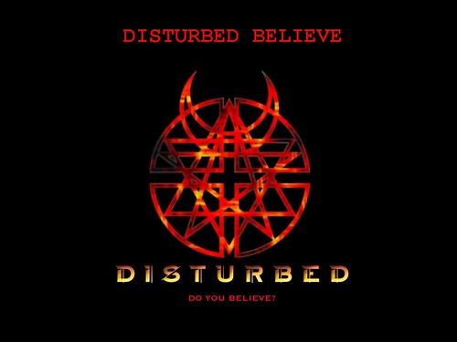
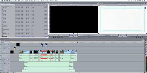
We decided that because we haven't filmed anything for our project yet, that we were going to do credit tests, too see which type of movement and fonts might suit our piece of filming best. For this we decided that we would use photoshop to see which font type might suit the genre best. We then decided, after looking at several different fonts that the best suited was 'chalk duster' as it created a mysterious look for our chosen idea, this then linked best.   The image on the right shows this example. 


when we chose this final font, and added it onto photoshop we then decided that adding in a type of motion to the image would make it look more attractive, and involve the audience more. In order to do this we had to add the motion key to the text and move as well as render the image into different areas on the page, this created a mysterious look to the page, and we thought it was an original idea. 


However, although there was movement within the text on the page, we thought that it still needed another effect, so we decided that by adding another effect to the font it will make it look original. So we then decided to add an effect called blink to the text, so it flickered while moving across the page, this made the font look more effective and attractive to the audience, in comparison to the first idea. 

Music Ideas

http://www.youtube.com/watch?v=Bg57C0DzDk0

We liked this piece of music because it created a sense of mystery which is what we are looking for. It also confuses the viewer of what their emotions are, a mix between sadness and vulnerable. We want empathetic sounds with a strong beat and mysterious undertone. We would like the sound effects of clocks and a gun shot.