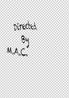
 We decided that because we haven't filmed anything for our project yet, that we were going to do credit tests, too see which type of movement and fonts might suit our piece of filming best. For this we decided that we would use photoshop to see which font type might suit the genre best. We then decided, after looking at several different fonts that the best suited was 'chalk duster' as it created a mysterious look for our chosen idea, this then linked best. The image on the right shows this example.
 when we chose this final font, and added it onto photoshop we then decided that adding in a type of motion to the image would make it look more attractive, and involve the audience more. In order to do this we had to add the motion key to the text and move as well as render the image into different areas on the page, this created a mysterious look to the page, and we thought it was an original idea.
However, although there was movement within the text on the page, we thought that it still needed another effect, so we decided that by adding another effect to the font it will make it look original. So we then decided to add an effect called blink to the text, so it flickered while moving across the page, this made the font look more effective and attractive to the audience, in comparison to the first idea.
No comments:
Post a Comment